• About
  • Contact Me
  • Disclosure

accentBritain

~ a romance with art and all things British

accentBritain

Tag Archives: waves

More Patterns

21 Tuesday Aug 2018

Posted by pat in Art, paintings, sketching, Uncategorized

≈ Leave a Comment

Tags

coastal paintings, oil painting, Portugal, waves

When a client loves your work, but it doesn’t quite fit their space, consignment work is often a solution.  I was nervous about this type of work when I first started painting full-time and had a few requests.

But then, I realized in my decades as a creative director for my own graphic design firm in Washington D.C., interpreting a client’s wishes with beautiful color and design had been the way I made a living for many years.

The only difference in fine art, was that the question it had to answer was “will it fit in with my aesthetic lifestyle”.  “Will it touch the new patron emotionally with color, content and design” is common in both commercial art and fine art. In my design business I often, after a few conversations, had to figure out a way to solve the problem in a way that I loved, but also pleased the client. Art commissions work the same way.

Patterns II started with the client loving a piece they had seen in one of my great galleries that represents me, Gallery 37, in Milford DE.  Having seen one of my wave paintings and loving the style and color patterns, they wanted something larger for their home.  After some back and forth meaningful dialogue, I realized it was the color palette, movement, serenity and the rock formation that had intrigued them in the smaller painting they had seen which was based on a seaside scene in Portugal I had photographed years earlier.

I found it was a joy re-visiting a painting that brought back memories of the trip along the Portuguese coast and a unique photo session for the original painting.  As I was working on a new interpretation, I thought of Monet and his Rouen Cathedral and haystack paintings…subjects he returned to again and again.

I was happy with the results, as was the client. There is a satisfaction not just in the physical painting, but also in interpreting the clients dreams of a piece of art they will live with and love for a long time.

Patterns II, 48 x 36″, oil

Reinvention

03 Saturday Dec 2011

Posted by pat in Art, paintings, Travel, Uncategorized

≈ Leave a Comment

Tags

branches, painting, Portugal, travel, US Virgin Islands, waves

It is interesting that just after I finish mentioning Pringles of Scotland as one of the 10 design firms sited in my post “British Fashion…’tis the season“, I came across an article about the company.

December 2011 Vogue article on reinventing the Scottish company Pringle

In the December 2011 issue of Vogue (American) there was an interesting story in the “View” section about the traditional Scottish sweater company reinventing itself to stay abreast of modern fashion, while still being true to its core identity.   It started me thinking of how many times over the years I needed to reboot my life or work or art to keep it fresh and exciting without losing what was “me” about it.

Now, I can definitely be a creature of habit. But, I also get bored if I let things stay static for too long.  It was with that in mind that My Beloved Brit and I sold our house and I sold my business in Washington, DC and we picked up everything and moved to the Caribbean for 8 years not knowing anyone there or having a clue as to how it would work out (it worked out great).

"White Cottage" the house we built with our own bare hands and a small crew on the caribbean island of St. John

And of course for many years I had my design business which I found I had to periodically tweak or twist in order to keep things current. But the core values and style of the company remained the same.

My art is like that.  I know artists who find a style and subject they are very comfortable with and keep it for ages.  Part of me envies that.  But I could never do it.  I tend to work on a series for at least a year or two and then start looking for a new viewpoint or subject or technique or color palette. New horizons.

For example, when we first moved back to the states returning from the islands, I had the luxury of spending a year exploring a new direction of painting.  That is when the wave series began.  I had realized that all over the world (and we were always searching out the sea no matter where we travelled) the waves were in many ways universal.

Waves in the Caribbean near "White Cottage"

Of course there were always endless variations, yet there was so much common ground…

Portuguese waves. photo by me

…but I was wondering how much the appearance and feel would depend on the waves geographical location. It became a game. We spent a few weeks searching the western most coast of Europe looking for the edge of earth closest to the Americas.  Would a wave on the extreme east of the Atlantic be similar to the waves on the extreme west coast? Someone told us the most western coast was in Spain, so off we went to look for waves.

After a stop for a few incredible days in Santiago de Compostela, Spain  (a UNESCO world heritage site and the pilgramage destination featured in the current movie “The Way”), we set off with our Michelin Tourist and Motoring Atlas to find Cabo Fisterra, a small point of land jutting out into the sea.

Cabo Fisterra, Spain, the end of the earth

It was amazing. After driving through tiny villages with mussel farms in the bays (they look like rows of swimming floats) we found what we were looking for. The monument wasn’t totally impressive…

The lighthouse at Cabo Fisterra

…but how were the waves?  Spectacular and strange – different from anything I had ever quite seen before.

The waves in Spain reach towards the west. photo by me

Wave painting by me. Private collection

The sun came out in Spain

Truly magnificent waves stretching their white foam in beautiful patterns, and bits of almost Caribbean blue water near the shore, but the furthest west? We headed to Portugal.

Pat at Capa Rocha in Portugal. The height of the cliffs overlooking the waves was frightening.

Another friend mentioned that they were sure the furthest coast west in Europe was north of Lisbon, and that there were incredible waves.  And sure enough, it was spectacular.

After a night at another great hotel (we lucked out on an internet travel site and found a great rate at the Penha Longa Hotel which turned out to be a Ritz Carlton as well as a bargain) near the town of Sintra, we set out for the coast for a day of exploring.  The cliffs were so high it was frightening, and to get the perfect angle on the waves I had to lean over the edge of the cliffs laying flat on my stomach with my camera.  I am petrified of heights, so MBB agreed to hold on to me.  Now that is trust. But I got the shots.  Enough for many paintings.

The cliffs at Capa Rocha. Photo by me with assistance from MBB

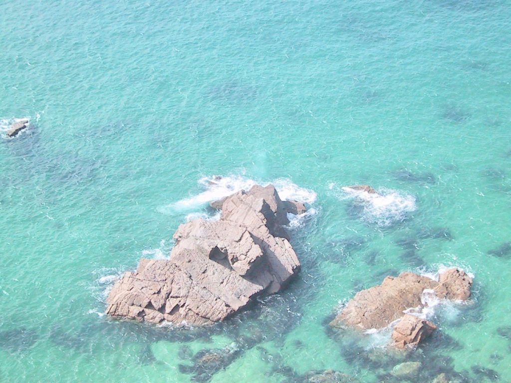
More waves in Portugal. Worth the trip. Photo by me.

We finally headed out after two days of incredible vistas. We were guests for a night at the home of MBB’s British expat friends living south of Lisbon in Batlha.  After a wonderful dinner buffet (despite some mystery things that looked like a tiny octopus) at an atmospheric restaurant in a nearby village, MBB and our host decided the only way to solve the problem of which point was the furthest west, was to run a GPS on the computer. The men gathered around the screen with great intensity. Portugal won, but I painted both country’s waves…and then some.

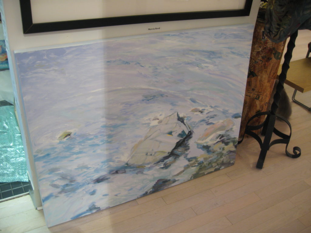
Wave from the Portuguese cliffs, Gallery 50

I painted waves from Maine, and the Caribbean and Florida.  I was in the studio for over a year painting waves.

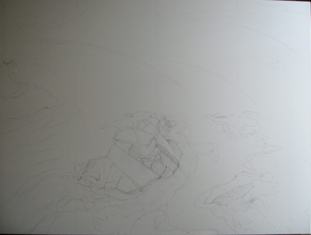
The beginning of Wave #15, a caribbean wave

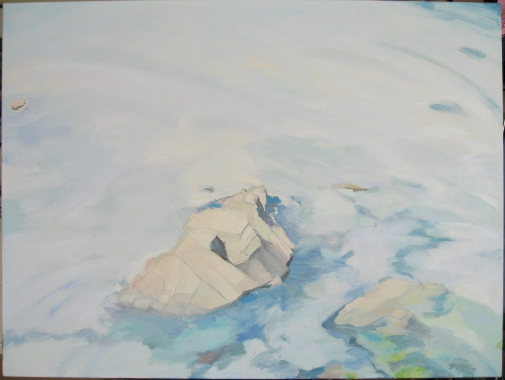
the caribbean wave in progress in the studio

Wave #15 finished

There was always another wave to explore.

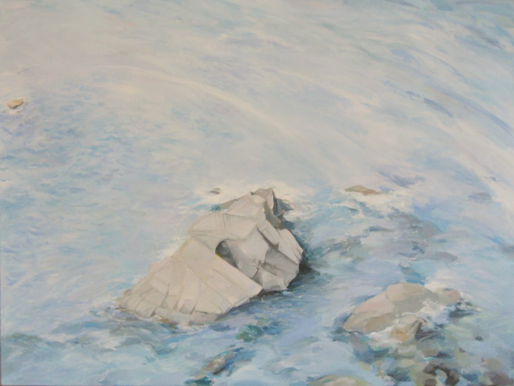
Wave from Portugal, artist's collection

Wave #10, Caribbean, artist's collection

A Florida wave triptych, artist's collection

I couldn’t stop painting waves.

Until one day I did.  I was surrounded by the most gorgeous trees at our house in America, and soon we went back to England for another short summer.  As I have said before, there is no better way to appreciate a good garden than to see it dripping in mist and hugged by fog.  I was off.  It was now branches…and woods… and fields.

the start of a new series...branches

Branches II


Branches 1

I guess what I am trying to explain is that exploring new worlds is good.  I loved the waves, and sometimes return to that subject with great joy.  But I am always curious about the next series…what is around the next corner.  And I think with life, and work and a truly good relationship, it can make all the difference in the world. Just stick to the core values, but look at it with a fresh eye and add a new twist of color.

Branches in Maine at the end of a walk with friends

The start of "How Golden Branches Weave the Light"

Final version of "how Golden Branches Weave the Light", artist's collection

It keeps everything very exciting.  There is always time for one more adventure.

One more wave


Art on the move

10 Monday Oct 2011

Posted by pat in Art, paintings, Uncategorized

≈ 4 Comments

Tags

art, oil painting, waves

I am getting ready to transport some paintings down to the Admiralty Gallery (www.admiraltygallery.com) in Vero Beach Florida for the start of their season.  This beautiful space facing the Atlantic on Ocean Drive has graciously represented me for several years now, and it is always exciting to start a new season with them.

This year I have tried a new form of expression in oils – abstraction.  But the essence of all of my paintings…nature based, energy and motion, color play…is still evident in these works. It has been liberating to do a less “realistic” color palette, but, I must admit, I miss the more immediate connection to actual representative art from nature.

We’ll see where it goes.

Dusk, 28 x 22, oil painting

As usual, all the new pieces are based on my travels.  In the wave series, which I have explored for over 7 years now, I found the inspiration at various locations from the coast of Great Britain, to Portugal and Spain, the Caribbean Islands, and Maine.  (You can see more of these works on www.patwhitehead.com) This particular piece, Wave #26, was based on waves I had seen in Florida on a reference expedition.

Wave #26, 36 x 24" oil


When I decided to take on abstract painting this past summer, I found that the technique that I had used on the wave series was the same here. I first decided on a composition based on something I had seen, then started to explore color and motion within that framework.

In Horizon, I had initially done a small pastel sketch of wave motion, always looking at the underlying tones of highlights and shadow.

pastel sketch reference

Horizon, 12" x 16", oil painting


It is interesting to see the underpainting steps that lead up to a more realistic “wave” painting and compare it to one of the abstract paintings.  I still struggle more with the abstracts.  There are so many more options for color. You’ll see what I mean:

Step 1, “Wave #27” – I wanted a bright undertone to these waves, and to immediately establish the motion of the surf.

Step #2 – I rough in the color palette on top of the underpainting. Because I use a mixture oil paint and linseed oil on the top layers, they can be transparent and show hints of the layers beneath.  Also, I often scratch the surface to reveal these different layers.

Step #3 – I begin to add highlights and detail–more layers.

Final – notice the strokes blending the different layers, and other colors being added to put emphasis on certain areas. At the very end I add spray detail.

Wave #27, 24 x 18", oil painting


When I began on the abstract, First Blush, I was concentrating on a band of pink flowers I had seen.  I made the undertones of the background dark to highlight the brightness of the pink.

Step #2 – I was still torn as to how dark I wanted the background area to be, and I was having some difficulty removing myself from the detail I often paint.

Step #3 – After many days of going back and forth, I decided I wanted to really emphasize the pink with a lighter, fresher background, and show much less detail. The emphasis was to be on the feeling of lightness.

Step #4 – I still wasn’t happy with the contrast although I loved the movement and soft tones. The solution was to go even lighter on the background, add more subtle motion in that area, and really pop the Rose Madder color.


Finally, I got it just where I wanted. Sometimes the real beauty is found after much struggle. And sometimes you just trip in to it.

"First Blush", 18 x 24", oil painting


♣ Subscribe to Blog via Email

Enter your email address to subscribe to this blog and receive notifications of new posts by email.

Join 27 other subscribers

♣ Archives

  • September 2022
  • May 2022
  • January 2022
  • November 2021
  • August 2021
  • May 2021
  • January 2021
  • September 2020
  • June 2020
  • May 2020
  • March 2020
  • December 2019
  • October 2019
  • July 2019
  • April 2019
  • March 2019
  • December 2018
  • November 2018
  • October 2018
  • August 2018
  • March 2018
  • January 2018
  • July 2017
  • April 2017
  • February 2017
  • November 2016
  • October 2016
  • July 2016
  • May 2016
  • April 2016
  • January 2016
  • July 2015
  • June 2015
  • March 2015
  • January 2015
  • December 2014
  • November 2014
  • October 2014
  • September 2014
  • July 2014
  • June 2014
  • May 2014
  • April 2014
  • March 2014
  • February 2014
  • January 2014
  • December 2013
  • November 2013
  • October 2013
  • September 2013
  • August 2013
  • July 2013
  • June 2013
  • May 2013
  • April 2013
  • March 2013
  • February 2013
  • January 2013
  • December 2012
  • November 2012
  • October 2012
  • September 2012
  • August 2012
  • July 2012
  • June 2012
  • May 2012
  • April 2012
  • March 2012
  • February 2012
  • January 2012
  • December 2011
  • November 2011
  • October 2011
  • September 2011

♣ Recent Posts

  • Autumn Stroll on the C&O Canal
  • A Winter’s Project
  • A Walk In The Park
  • An Adirondack Pond
  • Golden

♣ Categories

  • Art
  • Art Museums & Exhibitions
  • Bath
  • Books
  • British Virgin Islands
  • Burnham-on-Crouch
  • cars
  • Cornwall
  • Cornwall
  • England
  • entertainment
  • Fashion
  • Food
  • Gardens
  • Grasmere
  • Guana Island
  • History
  • Lake District
  • Lake District
  • London
  • movies
  • Music
  • National Trust
  • Olympics
  • paintings
  • Peak District
  • Sailing
  • Scotland
  • Shopping
  • sketching
  • The New Forest
  • The Royal Family
  • Travel
  • Uncategorized
  • United Kingdom

♣ my button

accentbritain.com
<a href="http://accentbritain.com" target="_blank"><img src="http://accentbritain.com/accentBritainbutton.jpeg" alt="accentBritain.com" width="125" height="125" /></a>
Copyright 2011 accentBritain LLC. All rights reserved. All original photos, text and art is copyright protected.

Proudly powered by WordPress Theme: Chateau by Ignacio Ricci.


Loading Comments...